Empty states
Empty states occur when there is no content to be shown.
Component meta
Component identifier
- pattern-emptystates
Design principles
- ConsistencyAim to explain
Guidelines
Short description
An empty state happens when there’s nothing to show in a particular context. A useful empty state will let the user know what’s happening, why it’s happening, and what to do about it. An empty state is an opportunity to engage the user and even to delight them.
When and how to use it
Use an empty state to convey that something is missing/not available and if needed what the user can do about it. The most common types of empty states are:
- First use
- No result
- User cleared
Empty states can be added in different locations depending on their purpose, such as in a page, modal, card (container for widgets, related blocks etc.) and content /tables, graphs, lists etc.) The empty state should look different depending on the reason why it is shown.
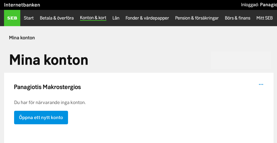
Behaviour
The empty state contains four items:
- Icon (optional)
- Header (optional)
- Description (mandatory)
- Call to action with a button or link (optional)
Depending on the reason why the empty state is being shown a combination of the items should be used to achieve the best experience for the user. In some cases we want the user to take action other times a simple description is preferred to let the user know the reason the empty state is shown.
For wider viewports such as in tablet and desktop, the icon should be placed to the left making sure the actual message is brought up closer to the beginning of the empty state container. The whole message is aligned to top left.
An empty state in a mobile/hybrid context is vertically centered in the viewport.
Do's and don'ts
Do
- Only use icons, never illustrations or pictograms
UX text
Note
Keep message brief
Keep the message brief, but not abrupt. The costumer might already feel disappointed in this situation, so make sure the message doesn’t add to that feeling. Write a kind but factual statement saying that the data usually displayed here is not applicable.
Be contextual, personal and helpful
Let the message be contextual. An empty state on My funds should be about funds, not about data. Be personal by using the pronouns you and we. Be helpful by telling the customers how they can fill the empty state.
Add a call to action if needed
Many, but not all, empty states should contain a call to action. When the customers realize that there is an opportunity to do something, they might be very interested in doing it, for example applying for a loan, buying stocks or getting Swish.
Upper and lower case
Don't start each word in headings and labels with upper case. Only use upper case in:
- The first letter of the first word
- The first letter of proper names
- Abbreviations
Situations for empty states and how to write
First use
The costumer does not have a certain service:
- Tell the customers very briefly what the service is about and tell them what they can see on this page when they get the service.
- Tell the customers how they could get this service. Don’t use the word currently, use yet instead.
Examples
"When you have cards in SEB they are displayed here. You do not have an SEB card yet. Would you like to apply for one? Please read more at page.com"
"När du har ett eller flera kort i SEB visas de här. Du har ännu inget SEB-kort. Vill du ansöka om ett? Läs mer på sidan page.com"
Before the customer has started using a service or function:
- Tell the customer very briefly what kind of data is displayed here, once they start to use the service.
- Ask if they want to proceed and by/order/register.
Examples
"Once you start making regular monthly investments in mutual funds your funds will be displayed here. Do you want to start a monthly saving? Please read more at page.com"
"När du har börjat spara i fonder visas dina fonder här. Vill du börja månadsspara? Läs mer på sidan page.com"
User cleared
The cart is empty or there are no orders:
- Let it be very clear that the cart is empty.
- Tell the customer very briefly what kind of data is displayed here once they have put something in the cart.
Examples
"You have currently no e-invoices to manage. When you get a new invoice it is displayed here and you can pay it."
"Just nu har du inga e-fakturor. När du fått en faktura visas den här och du kan betala den."
No result
No result in search:
- Explain that there is no result from the search, preferably by saying we did not find, instead of there is no ….
- Give a relevant tip on how the customer can enhance the search. Don’t just say try again unless it really would lead to a result to try the same thing a second time.
Examples
"We cannot find the recipient you are looking for. Search tips:
- Check the spelling
- Try to use less specific words or fewer words
- Try to use a synonym"
"Vi hittar inte den mottagare som du söker. Söktips:
- Kontrollera att orden är rättstavade
- Försök med fler generella ord eller ta bort ett sökord
- Prova att använda en synonym"
Do's and don'ts
Do
- Do address the reader directly by using the pronoun you.
Don't
- Don’t use the word currently (för närvarande) unless it is a temporary situation.
Examples
Examples for hybrid, mobile and native
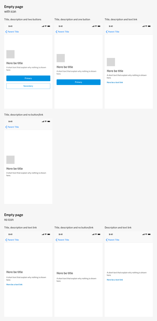
Empty page - with and without icon
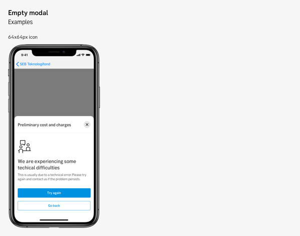
Empty modal
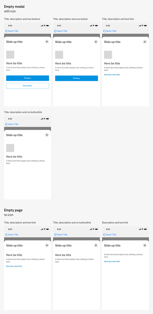
Empty modal - with and without icon
Examples for desktop

Empty state with higher attention
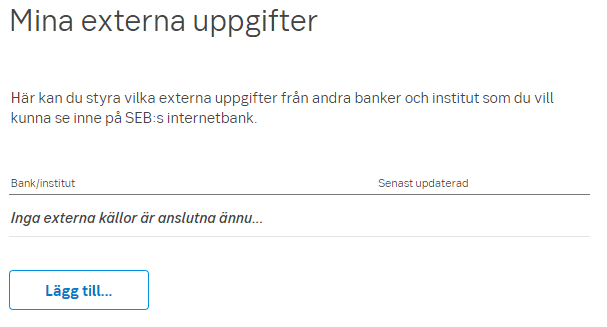
Empty states with low attention
