Progress bar
A visual representation of progress for loading content.

Guidelines
Short description
With a progress bar, users can follow the progress. It can show an approximate percentage of completion (determinate), or indicate that an operation is ongoing (indeterminate).
Usability studies have shown that users are aware of response times of over one second. Consequently, consider operations that take two seconds or longer to complete to be lengthy and in need of some type of progress feedback.

There are two types progress bars.

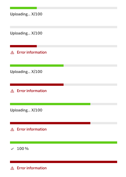
Determinate progress bar

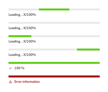
Indeterminate progress bar
When and how to use it
Determinate
Use this indicator when loading content within a page, widget or module. It indicates that content is loading and visualises the process from 0% to 100%.
Contextual determinate
Use this indicator when loading content within a page, widget or module. It indicates that content is loading and visualises the process from 0% to 100%. In addition to the bar, it highlights how much something has been loaded in text.
Indeterminate
Use this indicator when loading content within a page, widget or module. It indicates that content is loading, but does not present how much is loaded.

Determinate

Contextual determinate

Indeterminate
Behaviour
Progress indicators should behave the same way regardless of device or resolution.
Multiple indicators can be shown at the same time to indicate that different content areas are loading. It is possible to use an indeterminate bar that results in an determinate bar (but not the other way around).They can also be queued in a sequence to show how additional content is loading, i.e. when expanding a row to show its details.
Do's and don'ts
Do
- Give the user the user a visual cue when content is loading.
- Add as part of input field validation, enforcing the understanding of when the requested value is fulfilled.
Don't
- Refrain from adding progress indicators for all sub items, try instead to show one per content area.
UX text
If the waiting time is long enough, you can show a text explaining to the user what
- is happening or will happen
- we (the bank's system) are doing
- the customer soon will know or see
Accessibility
-
Specification
- Details: Specification in Figma
- Instruction: How to access Figma
