
Colours
Colour can be used to express emotion and tone, as well as place emphasis and create associations. Use it in meaningful and intentional ways in order to create patterns and visual cues.
Guidelines
Short description
At SEB we use colours more sparsely. This page covers the usage of colour for digital products. For general perspective on SEB colour usage in print and media, read the SEB visual guidelines.
Specifically used colours
Background
- White
- Background
Both white and grey can be used.
Text
- Base 800
More about Typography
Link
- Link
More about Links
Error
- Error
More about Error handling
Dark mode
Our colours are used differently in darkmode. Pattern: Dark mode
Do's and don'ts
Colour contrast
Do
- Make sure to have good contrast between text colour and background.
- Use a tool to check the contrast. (Here is one: https://webaim.org/resources/contrastchecker/)
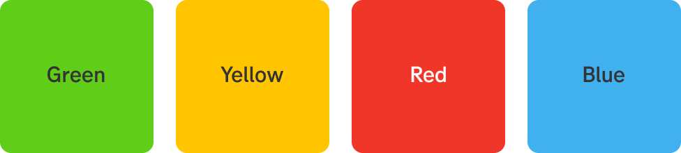
Good contrast
Don't
- Don’t use white text on a light background.
- Don’t make colours lighter except for in graphs. For graphs it’s possible to use several different colours.
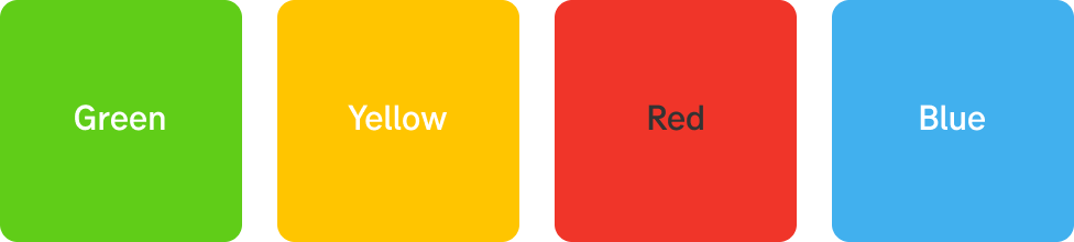
Bad contrast
Swatches
Colours
Green
- Green
- Dark green 1
- Dark green 2
Yellow
- Yellow
- Dark yellow 1
- Dark yellow 2
Red
- Red
- Dark red 1
- Dark red 2
Blue
- Blue
- Dark blue 1
- Dark blue 2
Greyscale
Use any shade of grey to support our primary colours.
- Base 900
- Base 800
- Base 700
- Base 600
- Base 500
- Base 400
- Base 300
- Base 200
- Base 100
SEB Senior, don’t use yet!
In 2025 a new primary colour was introduced in our brand guidelines. It’s called SEB Senior and will be incorporated into the next version of our digital design.
It’s not to be used in the current design system (2016).
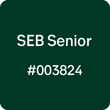
SEB Senior