
Grey news!
Our designers and developers must have the same references. Let's start with grey shades.
One source
One of the main reasons for Design Library to exist, is to support the great work and co-operation between our designers and developers. This means providing one source of truth.
1. We use the same grey shades
Lately we have been working on adjusting our grey shades to work across the organisation. A few things has happened:
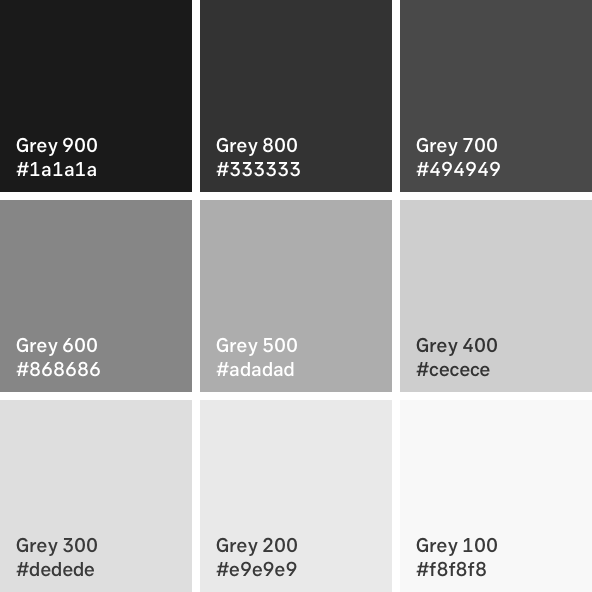
- Design Library and Sketch will use the same naming convention as SEB Bootstrap, i.e. from "grey 8" to "grey 800".
- Design Library and Sketch will change grey 100-700 to the same tones as in SEB Bootstrap.
- Bootstrap will change the two darker colours, grey 800-900 to the same tones as in Design Library.
Please make sure you use the visual identity package in Vanilla or Bootstrap as source for colours, so that next time we change, it will be automatic.
Correct grey shades
$white: #fff !default;
$gray-100: #f8f8f8 !default;
$gray-200: #e9e9e9 !default;
$gray-300: #dedede !default;
$gray-400: #cecece !default;
$gray-500: #adadad !default;
$gray-600: #868686 !default;
$gray-700: #494949 !default;
$gray-800: #333333 !default;
$gray-900: #1A1A1A !default;
$black: #000 !default;
2. We use the same grey background colour
The other topic is the grey background. There has been variations of greys used so far and although that is fine when it is a good reason behind it, let's start with having one as a standard. This is especially important when users can move across our platforms
Correct background colour
- Grey 100 #F8F8F8 or White
Colour guidelines: https://designlibrary.sebgroup.com/visual-identity/colours/#guidelines
/Ulrika,
Design management team
(Hands up if you are impressed that I didn't write one single reference to 50 shades of grey)