The button has changed (minor)
Thanks to your feedback the design has been updated.
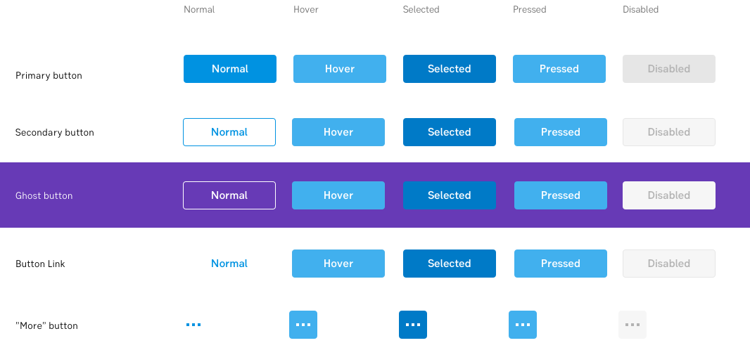
One of the components we get the most questions and feedback on, is the ordinary button. Our guideline has been a bit unclear on when to use them, and they also needed to work better on coloured backgrounds. We listened to you and are now updating the button. But don't worry, it's only by a little.
Changes
- Re-name “Alternative button” to: “Button link”
- Re-name “White outline button” to: “Ghost button”
- Changed guidelines, "Ghost button":
- Outline colour = white/your choice
- Hover colour = white/your choice
- We have also clarified emphasis and hierarchy of buttons (see below for details).

Hiarchy of buttons
An overview of the hiarchy of button versions.
1. Primary button (blue)
Purpose: See me! Click on me!
High emphasis.
2. Secondary button (white)
Purpose: One of several buttons.
Medium emphasis.
3. Ghost button (transparent)
Purpose: Use this on a coloured background.
Medium emphasis.
Button is transparent.
Outline: White/your choice.
Hover: White/your choice.
Used to be called "White outline button".
4. Button link (looks like a link)
Purpose: "Not important but still a valid choice"
Low emphasis
Button is "invisible”. Background is transparent.
It looks almost like a link, but is placed together with other buttons. Hover/click works the same as the normal button.
Used to be called "Alternative button".
Sizes
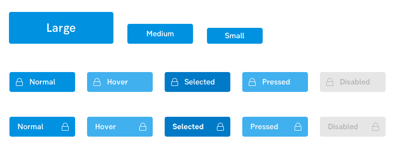
As before, buttons can be used in three sizes:
- Large (Start here!), height 64 px/font 24px
- Medium (most common), height 40px/font 16px
- Small (e.g. tables), height 32px/font 16px

Next step
Next step is to update the changes to the code. If you are responsible for a repository, please add this to your backlog. Thank you!
Related
Thanks to everyone that gives us feedback!
Conny, Ola & Ulrika
designlibrary@seb.se
