
Toast notification
A small message that shows up in a box at the bottom of the screen and might disappear on its own after few seconds.
Article meta
Tags
Design version
- 2020-10-24
Design principles
- Everyday firstFrictionless
Guidelines
Short description
Use a toast notification when you have short feedback messages, based on user actions to communicate. They are small and a little discrete, so make sure to use them with care.
Behaviour
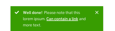
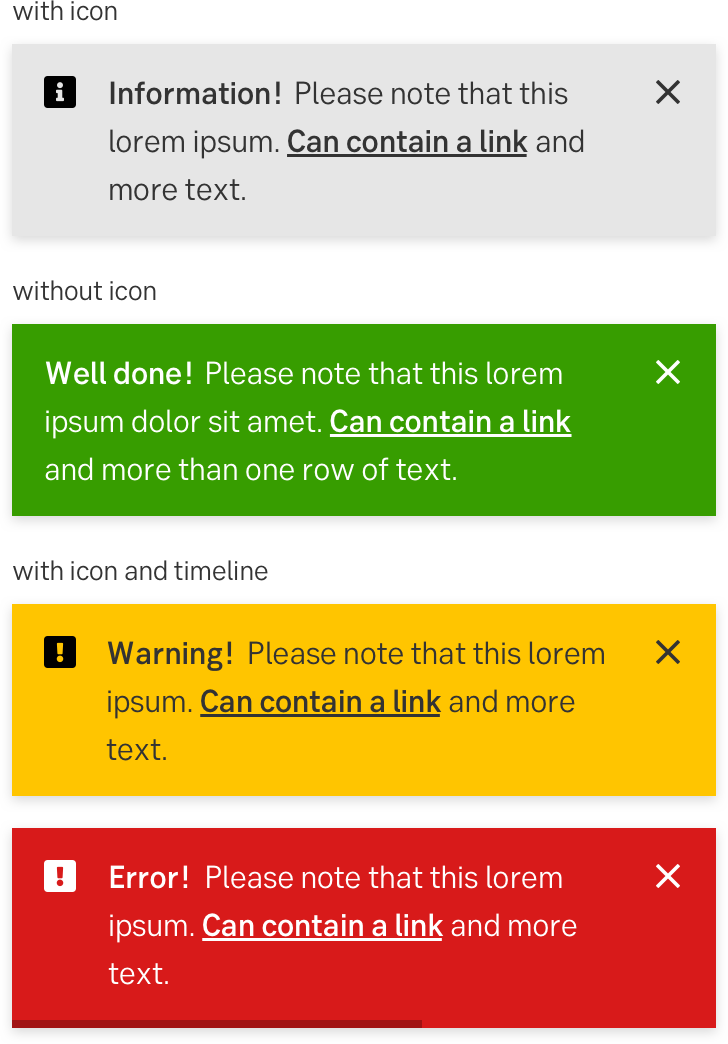
A toast notification slides up like a real-life piece of bread from the toaster. Some toasts have a timeout line in the bottom, which means that they will disappear (slide down) after a pre-defined amount of time. When the user hovers over such a toast, the timeout will pause. All toasts also have a close button.
When there are multiple toasts, they will stack upon each other with the "oldest" toast above the "new" toast notification.
Types of toast notifications
There are four types of toast notifications:
- Information: Grey (light grey or dark grey, depending on the background). Content that holds neutral information that we want to inform about.
- Success: Green. Should be used as a response to an action or something that is considered to be positive or a success.
- Warning: Yellow. Not an error but important information for a user to consider, or be aware of.
- Critical or error: Red. Used for errors or when something goes wrong.
When and how to use it
Examples of use:
- When the user feedback does not have a specified placement in the interface.
- When the user action dissolves a page, slide out or similar, in which the user performed the action.
- When the interaction takes the user to a new page, on which it is still necessary to convey feedback about the outcome of the action.
- Warnings or hints on something the user does or is about to do.
- Confirmations about smaller actions or new settings.
- Hints or questions to the user, for example "Do you want to give us feedback on this service?"
- As a notification method within the shell itself rather than a page specific feedback.
- Most often, it is preferable to let the user close to toast themselves but in some cases, such as a short positive feedback message (like "Done!") it can be dissolved by itself after a few seconds.
Placement
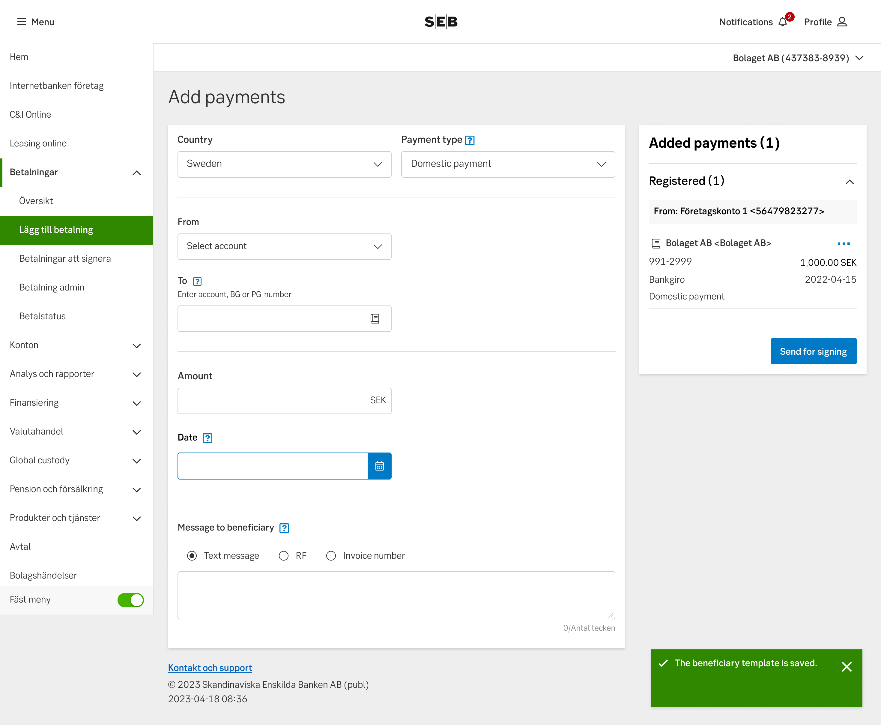
Place it in the bottom right corner, unless your interface has another clear placement for it.
Toast example
Do's and don'ts
Do
- Be specific and short in the actual message
- Add an icon to enforce the message (optional)
- Design it in relation to your grid size
Don't
- Don't write too much text in it
- Don't use time-outs in critical messages
UX text
The four types of toast notifications are used for four different types of short information:
- Information; information in general.
- Success; confirmations.
- Warnings; important information to be aware of.
- Critical and error; what the customer needs to do to be able to proceed.
Information
Information notifications may be used to hint or to ask customers to do something voluntary, for instance, to give us feedback on a service.
Information notifications may consist of:
- Information. Short hint, tip or voluntary request. The text does not have to start with the text Information.
- Instruction. Next step, for instance, a button, x or link.
Success
Success notifications should be used for confirmations about smaller actions or new settings. For instance, The money has successfully been transferred, Done! or Thank you! Your information is saved.
Why should we confirm?
- People expect digital interfaces to behave according to social norms.
- Confirmations are among the most important feedbacks that people expect to receive.
Success notifications may consist of:
- Information. Short confirmation that the action was done as intended.
- Instruction. Next step (might be a button, x or link).
Warning
Warning notifications should be used to inform the customers to consider or be aware of something they are about to do.
Warning notifications may consist of:
- Explanation. Short information of the problem and how long the problem will persist (if you know). The message should normally not start with words like Important, Note or Warning.
- Instruction. Next step (might be a button, x or link).
Critical and error
Critical and error notifications should be used for short information about errors or when something goes wrong.
Critical and error notifications may consist of:
- Explanation or instruction. Short helping text explaining what the customers need to know or do to be able to proceed with what they intended – now or later. The message should normally not start with the text Error.
- Next step (might be a button, x or link).
Upper and lower case
Don’t start each word in headings and labels with upper case. Only use upper case in:
- The first letter of the first word
- The first letter of proper names
- Abbreviations
Accessibility
-
Specification
- Details: Specification in Figma
- Instruction: How to access Figma