
Green updates - February 2023
2023-02-03
What is Green?
Let's introduce Green, as if you have never heard about it before.
Green was born as a grass root need (see what we did there?) from the design- and development communities. We all wanted, no, needed, resusable components that would speed up the development process but still maintain that SEB design quality.
The solution we saw for this problem is a design system, a way of working with design and code that many companies, such as Microsoft, Google, Shopify and Avanza, have implemented. It's time we did this at SEB.
Our design system: Green, is built on contributions. This is because it's impossible for one team that's building the design system to know all the different components and patterns that are needed to deliver a great user experience. Help is needed from the teams that build the products and is close to the customer/user.
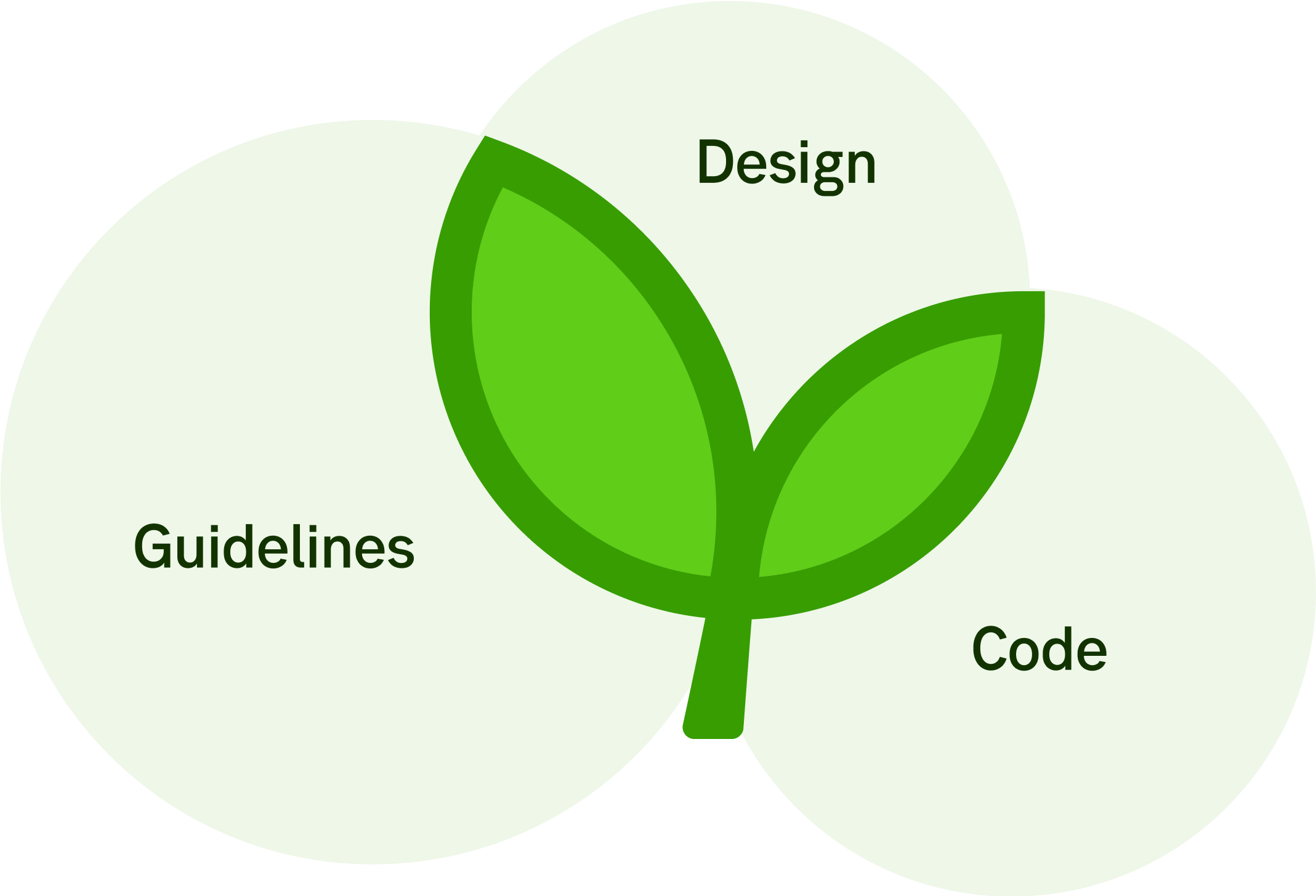
We POC'ed a solution which merged our three perspectives into one design system.
- The designed components in Figma (a tool for designing user interfaces)
- The coded components in Typescript (React & Angular)
- Interface guidelines in Design Library (a site that been around since 2017)
To keep these three areas in sync, there need to be processes and governance that are carried out by the Green team with a lot of contribution for the CX community as well as from developers.
Updates about Green in general
To make it easy to contribute to Green we created a Co-pilot-system where a team that has the need for a component and can develop it locally with support from a Green team member. When the need for a component has been solved with a component, the co-pilot will, with support from the team, migrate the component to the design system. This co-pilot initiative together with a feature checklist and Green coaching was implemented during autumn 2022 and is being fine tuned regularly.
- Green (code components) has had its first release as a stable version! We have been working hard at producing components and updating them to the latest design. We have reached a state where we are comfortable with letting go of that beta flag and embracing a stable products with continuous releases.
- At the moment we are working very closely with the consumer loans and mortgages teams that have contributed a lot to Green with components and insights from their applications improving the design system as a whole.
- Our Green team is working hard on updating and building components so that they are top quality and in sync over our three parts of Green. We focus on a list of 19 specific components (to start with). The components go through almost like an assembly line with design, text descriptions, images, code, cx-writing and accessibility. Three components are completely done: Alert ribbon, Radio button and Checkbox.
Figma updates
- Our visual designers have done a review of our current components designed in Figma and given them a small visual refresh.
- They also focused on building smarter interactive components in Figma based on Figma's Component Properties feature.
- We also taken a decision to move away from "base components" which has been a design pattern in Figma up until they released the new Component Properties feature.
Code updates
- Our main focus right now is to get as many components available in both React and Angular. Except for the main focus of 19 components synced all the way, new components arise in the collaboration with the consumer loans and mortgages teams.
Design library updates
- Our main focus on the Design library site this year is to create seamless relationships to Figma and Storybook. When something is updated in Figma or Storybook, the updates will also automatically be presented in Design library.
- The site is doing an inventory of its own components to gage which components should be Green in the future.
- The design community has contributed with guidelines for channel design.
- You can also find new link to the updated browser policy from Developer Garden.
- There is a new accessibility checklist that go together with an Excel document, made for reviewing services. It uses The Web Content Accessibility Guidelines (WCAG) as a reference point.
That's it for our first update but many more will come. Hope to see you soon!
/Ville, Marwin & Ulrika