
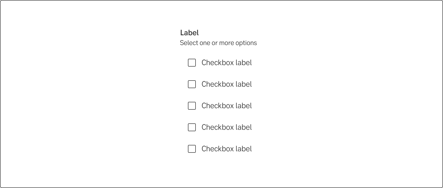
Checkbox
The checkbox allows the user to select one or several of the presented options. The checkbox can be used stand alone or in a group.
Article meta
Tags
Design version
- 2022-11-20
Design principles
- Everyday first
Guidelines
Short description
Checkboxes allow the user to make any number of choices, one, several and in some cases, zero. This means that each checkbox is independent of all other checkboxes and checking one box does not uncheck the others.
A stand-alone checkbox is used for a single option that the user can turn on or off.
When and how to use it
The checkbox component should be used when the user are presented with a list of options where one or multiple options can be selected. A user can immediately scan how many and what options there are. If you have to present a lot of options or have a lack of space, use a multiselect dropdown.
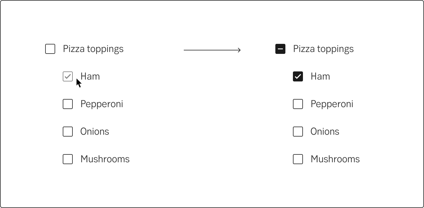
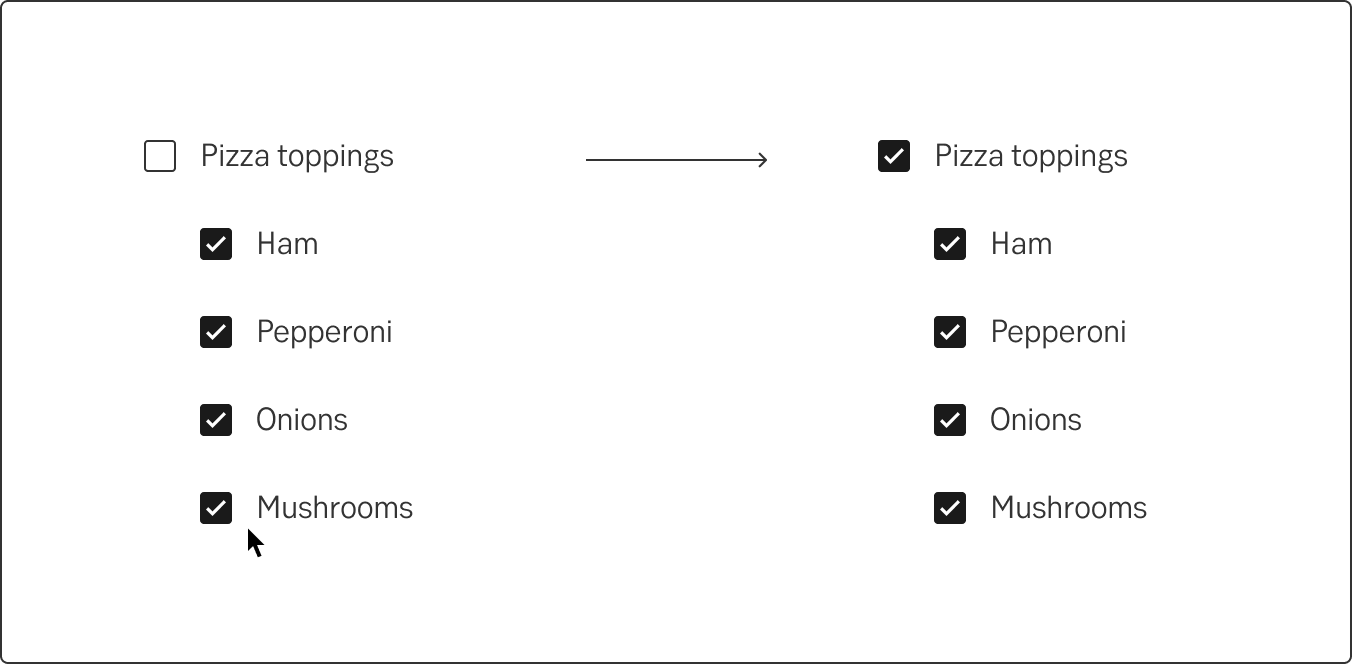
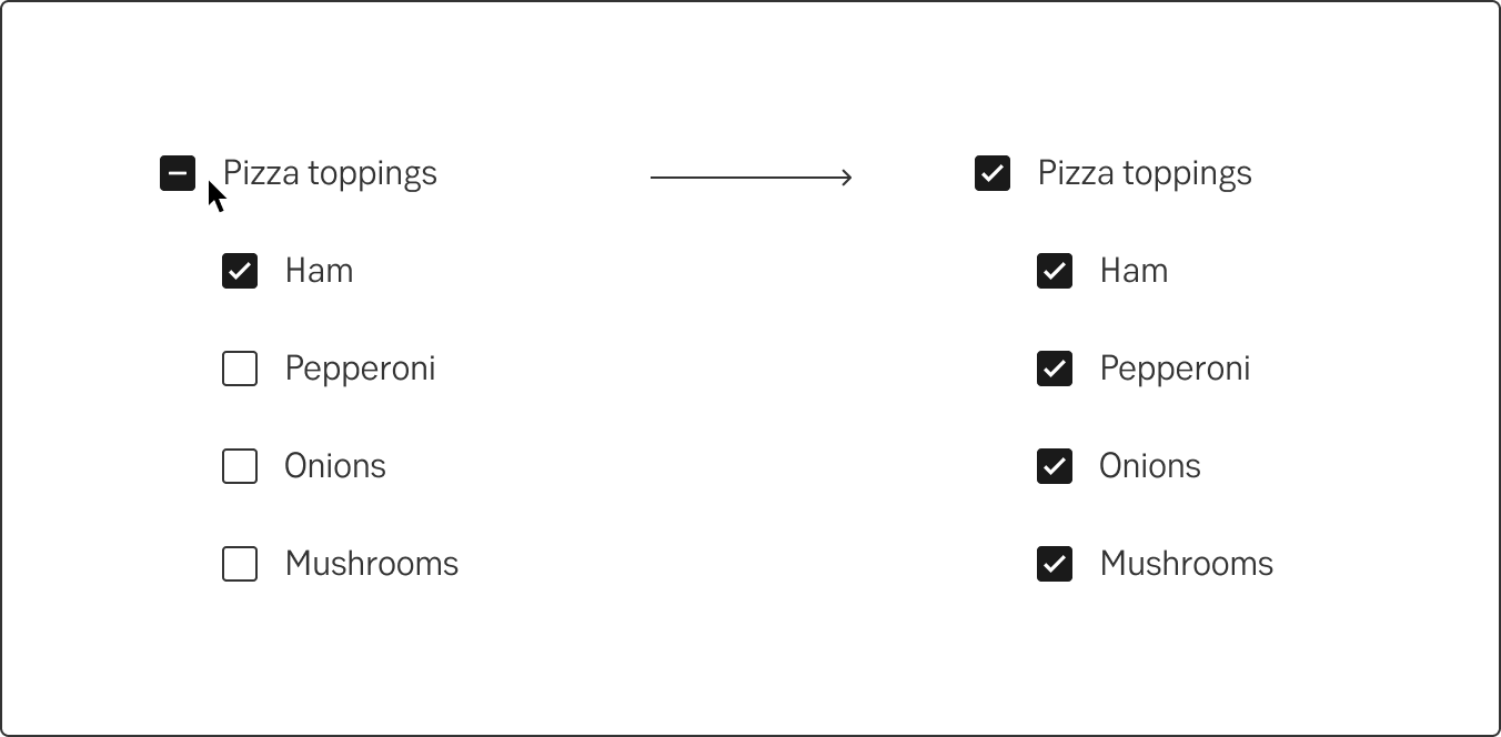
Indeterminate checkbox
There is a new family member, "Indeterminate checkbox". Its' state indicates when there is a parent checkbox controlling a group of child checkboxes. The indeterminate state shows whether only some children or all children have been selected.
- If some children are selected, the indeterminate state is visible on the parent.
- If all children are selected, the selected state is visual on the parent.
- If a parent checkbox is selected while unselected or in the indeterminate state, all children will be selected.
- If the parent is deselected all children will be deselected.
Do's and don'ts
Do
- When possible use a vertical layout
Don't
- Don’t use checkboxes for actions
Writing
Write checkbox labels so that the customers can easily understand what it means to check the box or leave it blank. It can be difficult when customers must check an individual stand-alone checkbox, for example, that they accept the terms or want to receive news and offers by e-mail. Or when they should be able to turn a setting on or off and it is essential that they actively take a stand on the choice. (If there is a default option that almost everyone will choose, use a toggle instead.)
The label and options must also be adapted to suit each other. If the field label is a yes or no question, the answer options should be yes and no and nothing else. Since the user can only choose one of these options, use radio buttons instead.
Furthermore, remember to write consistent options. Decide if the options should
- consist of complete sentences beginning with uppercase and ending with a full stop
- constitute one continuing sentence beginning with lowercase and only the last point ending with a full stop
or
- a single word or a couple of words and no full stop.
Negations
Avoid negations and use the I-form
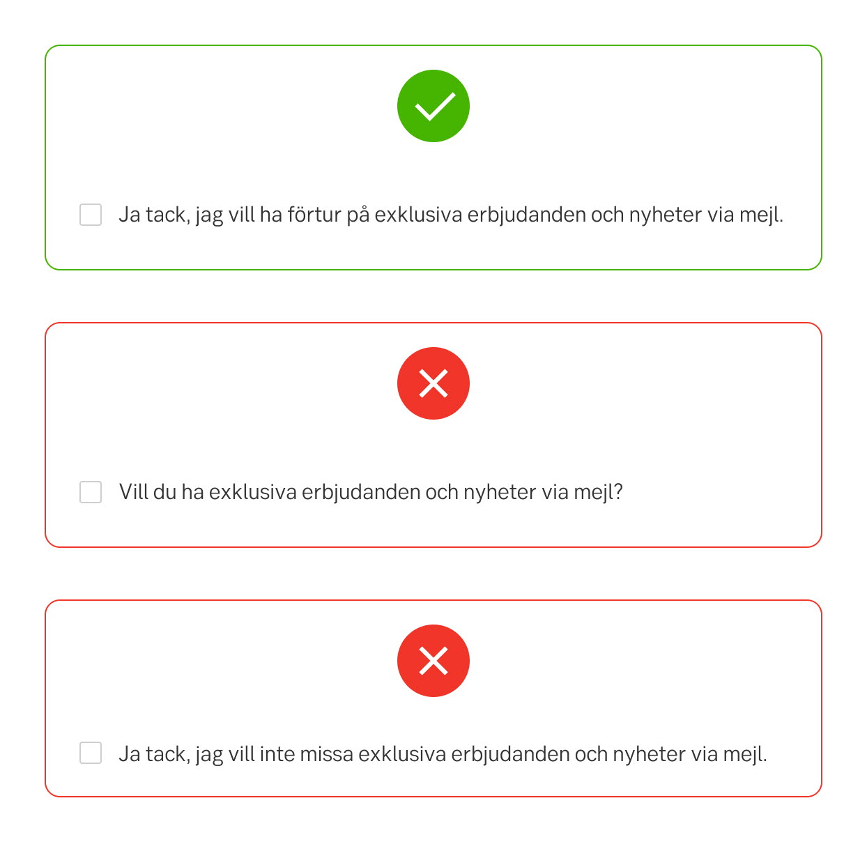
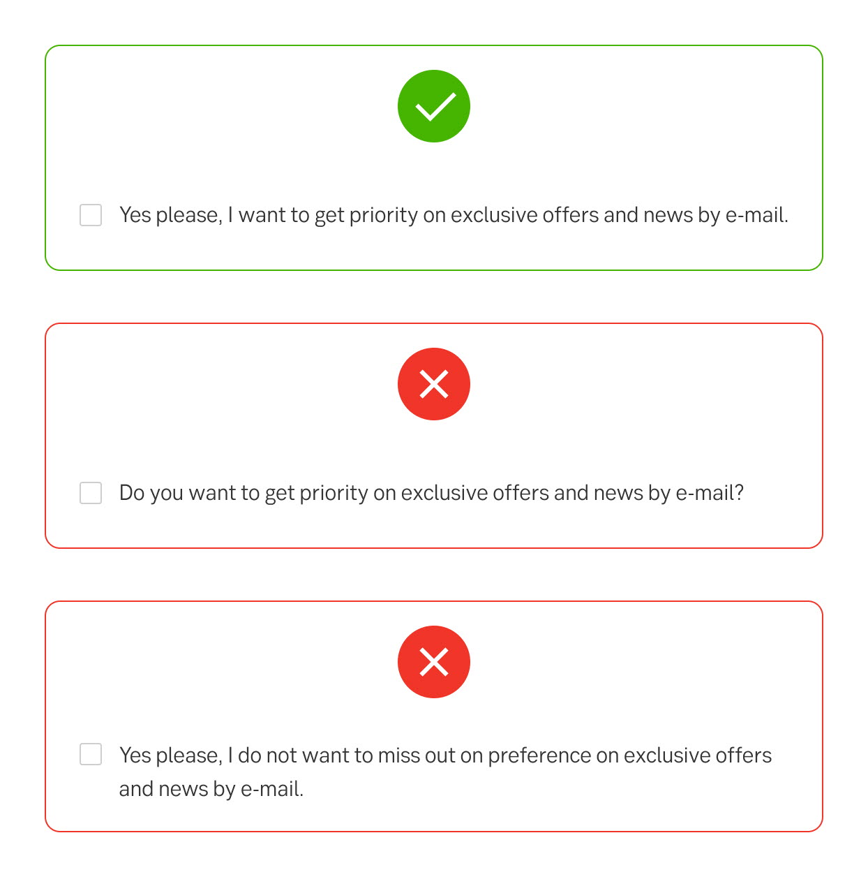
Avoid negations such as Do not send me more e-mails in the checkbox label, as this would mean that users have to check the box to prevent something from happening. Also, do not use questions like Do you want newsletters from us? The convention is to use the I-form for this type of checkbox.
Do
- Ja tack, jag vill ha förtur på exklusiva erbjudanden och nyheter via mejl.
- Yes please, I want to get priority on exclusive offers and news by e-mail.
Don't
- Vill du ha exklusiva erbjudanden och nyheter via mejl?
- Do you want to get priority on exclusive offers and news by e-mail?
- Ja tack, jag vill inte missa exklusiva erbjudanden och nyheter via mejl.
- Yes please, I do not want to miss out on preference on exclusive offers and news by e-mail.
Jag-form (Swedish)
I-form (English)
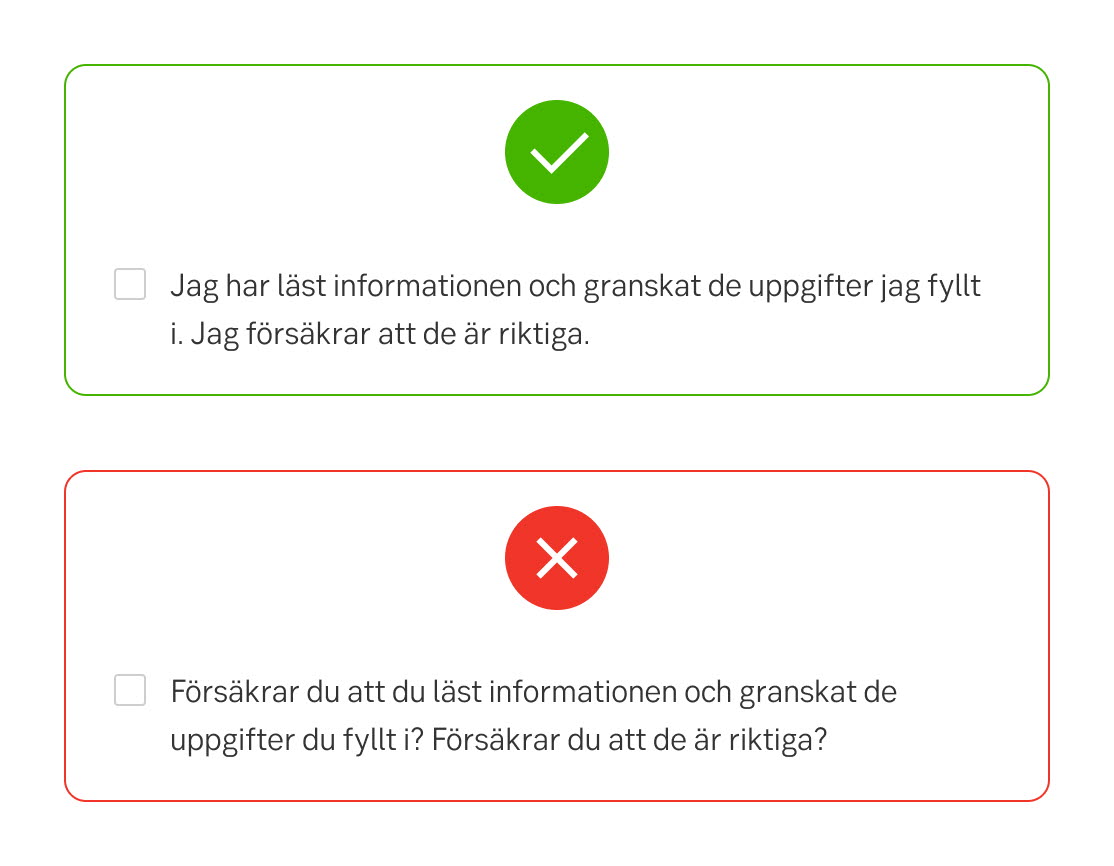
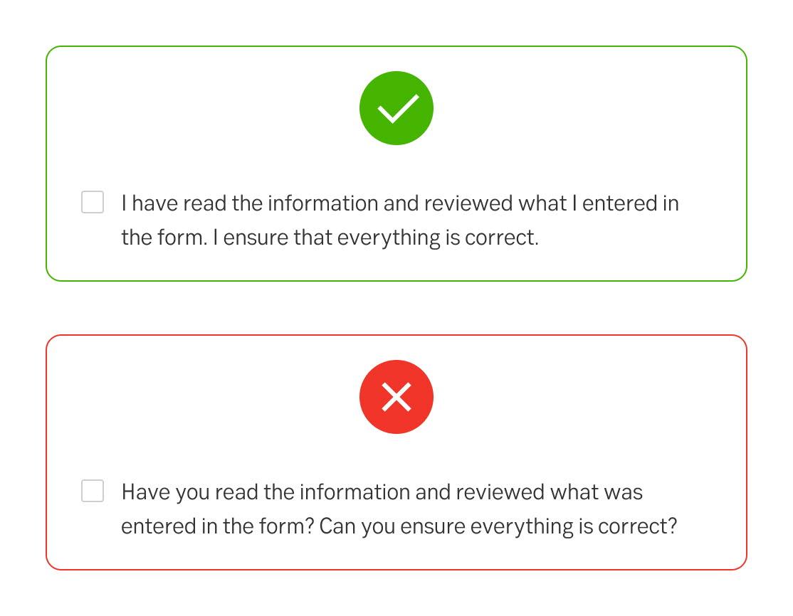
Accepting the terms
When the user accepts terms, use I-form and avoid a question
Do
- Jag har läst informationen och granskat de uppgifter jag fyllt i. Jag försäkrar att de är riktiga.
- I have read the information and reviewed what I entered in the form. I ensure that everything is correct.
Don't
- Försäkrar du att du läst informationen och granskat de uppgifter du fyllt i? Försäkrar du att de är riktiga?
- Have you read the information and reviewed what was entered in the form? Can you ensure that everything is correct?
Jag-form (Swedish)
I-form (English)
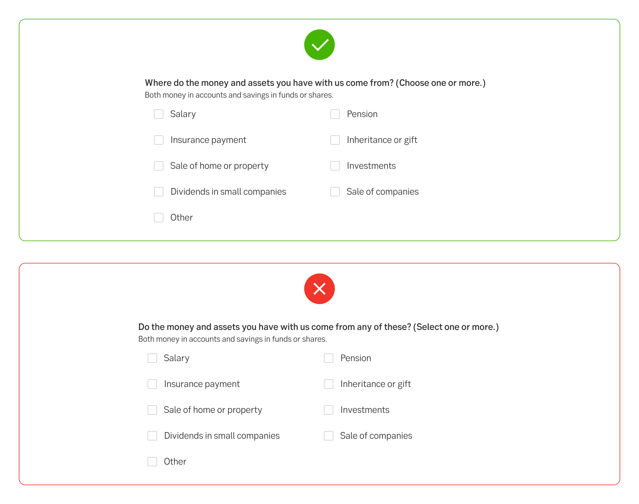
Multiple options
Decide if the options should consist of complete sentences beginning with uppercase and ending with a full stop, constitute one continuing sentence beginning with lowercase and only the last point ending with a full stop or a single word or a couple of words and no full stop.
Do
- Provide clear instructions that the user can select multiple options.
- The label and options must also be adapted to suit each other. If the field label is a yes or no question, the answer options should be yes and no and nothing else.
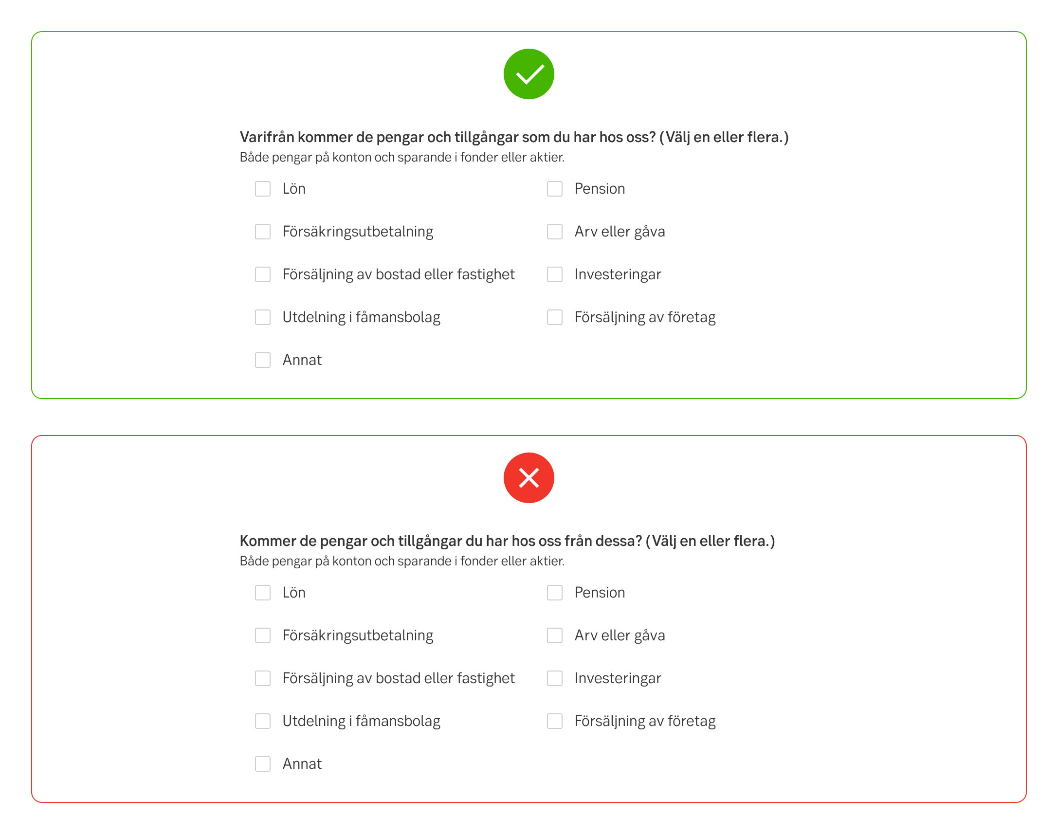
Multiple answers (Swedish)
Multiple answers (English)
Options texts
Do
- Write option texts that are consistent.
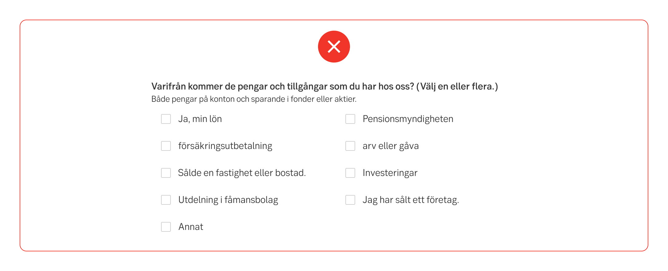
Inconsistent options (Swedish)
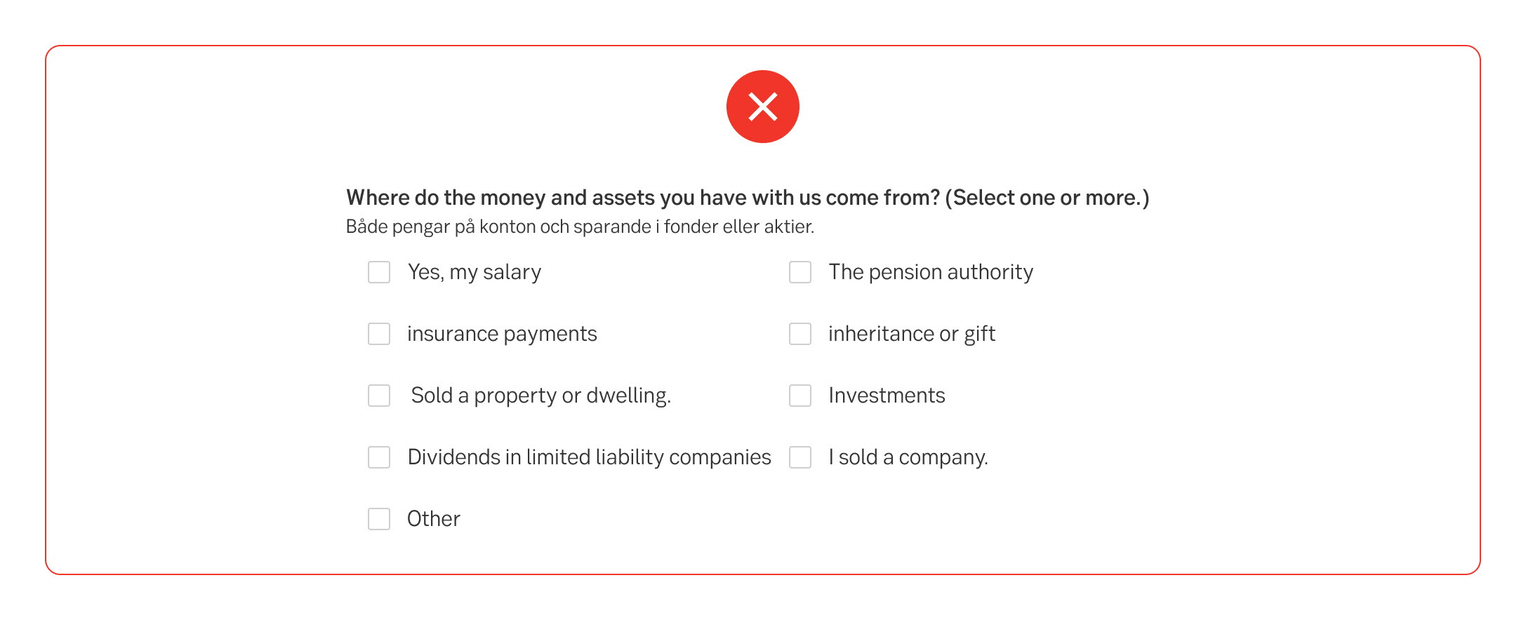
Inconsistent options (English)
Accessibility
From accessibility perspective it is recommended to place checkboxes vertically to make it more obvious which label corresponds to which option.
Review
Result from the latest accessibility review of the component (Chlorophyll, React): 2023-05-05
- Notes: Should most often only be used vertically
- Visual: Hover on selected fixed in latest version
- Contrast: good
- Colour-blindness: good
- Dark-mode: n/a
- Code + aria: ok
- Touch + keyboard: good
- Focus: ok - need new style
- Reader: ok - should have better example text
Specification
- Details: Specification in Figma
- Instruction: How to access Figma
Additional checkbox description
For some cases there may be a need for an additional description for each checkbox, i.e. for selecting additional services. If these descriptions are used, they must be used for all checkboxes in the same list.
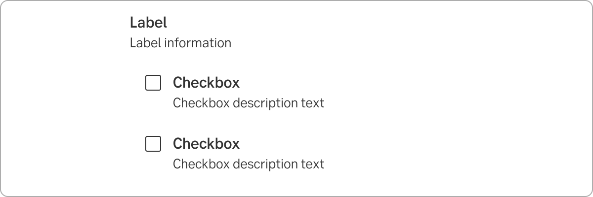
Checkbox with description for each checkbox
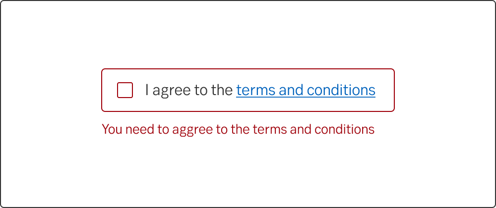
Error state
Dark mode
Read about Pattern: Dark mode