
Link
A link is an item like a word or button that points to another location. On click, a link will take you to the target of the link, which may be a webpage, document or other online content. A link is a way to navigate online content.
Article meta
Tags
Design version
- 2023-03-20
Design principles
- Everyday first
Guidelines
When and how to use it
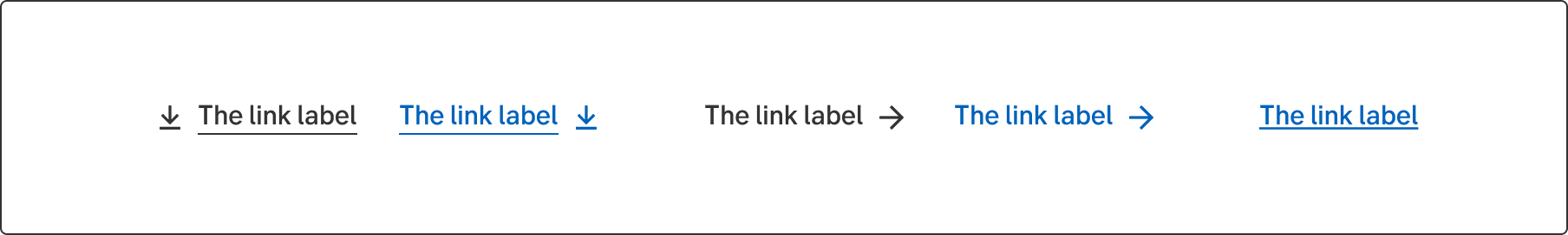
A link should always have a visible indication that it is a link. Using only colour for this, is not accessible enough. It should either have the underline visible, or a link icon, such as an arrow, chevron or external link symbol. When using a link icon, the underline is only visible on hover.
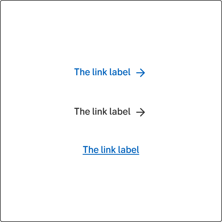
- The dark grey link is mostly used when the link is a stand alone, but the blue link can also be used there.
- In a paragraph, a link should always be the underlined variant.
- Use the blue link to differentiate the body text and the link even more.
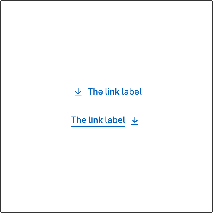
Icon placement
A link with a link icon
When using a link with a link icon, such as an arrow, chevron or external link symbol, the icon should always be placed to the right of the link label.
A link with an booster icon
The booster icon can be placed on both right and left side of the link label, depending on the layout and context.
Do's and don'ts
Do
- If the background is in a darker colour, it’s recommended to have the negative variant of the link in lightmode. For darkmode the other way around. The contrast always needs to be checked so the link gets a good contrast against the background.
Don't
- Never use only a colour as indicator for a link.
Writing
Use a verb that describes the user’s action
If the user is supposed to perform an action when clicking the link, try to use a verb in the active form that describes the action. It's fine to use two verb phrases, if the user must log in or go to a page to read more before performing the main action.
Never use the phrase "click here". Neither by itself nor in a longer phrase. It makes it unclear to the user what will happen. "Click here" links are also inaccessible for users with screen readers. Furthermore, "click here" doesn't work for users that don't use a mouse or use a phone or tablet to navigate the site.
Upper and lower case
Don't start each word in headings and labels with upper case. Only use upper case in:
- The first letter of the first word
- The first letter of proper names
- Abbreviations
Examples
Do this
- Start saving for your pension
- Read more about mortgages
- Become a corporate customer
- Log in and invest
- Read more and apply for a mortgage
Don't do this
Include only the necessary words
Sometimes the link can be a complete sentence, but don't make the sentence too long. Never include several sentences. Don't include preceding articles or punctuation marks.
Do this
- Unfortunately, this feature does not work in the browser Internet Explorer. Here you can read about the browsers we recommend.
Don't do this
- Unfortunately, this feature does not work in the browser Internet Explorer. Here you can read about the browsers we recommend.
- Unfortunately, this feature does not work in the browser Internet Explorer. Here you can read about the browsers we recommend.
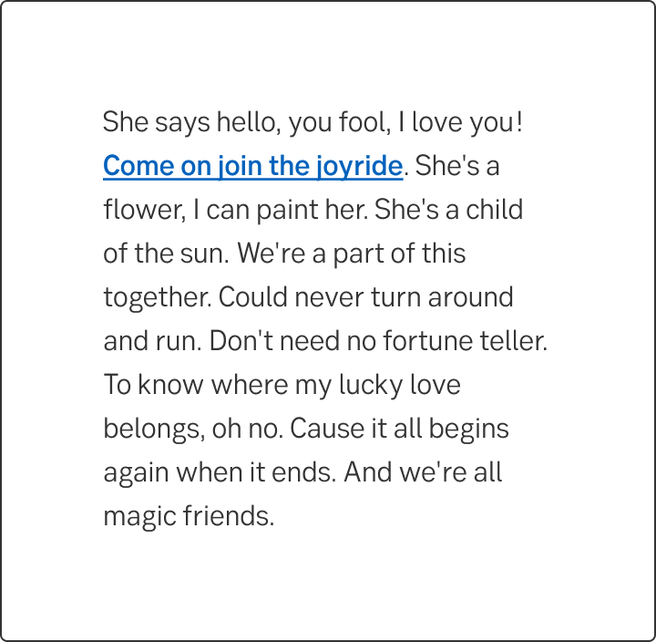
Should I place the link in or after the text?
The purpose of the text decides the placement of the links. If the user is supposed to read the text in its entirety, place the link after the text or in a separate link list. If the user reads the text to act, you can place the links directly in the text.
Link in the text
When the purpose of the text is to help the user navigate forward, you can put the link directly in the text.
- You can find the agreement under My agreements.
Link outside of the text
- Follow us on Twitter and LinkedIn to get the latest insight on corporate, institutional and investment banking.
Follow us on Social Media
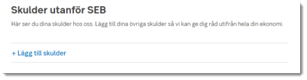
Add items to a list
Although links are primarily to be used for navigation, it happens that we use linked design for actions that the customer can perform. When the link indicates that it can add more of the same item to a list, you may begin the link text with a plus sign. For instance: + Add another company
However, links that indicate that the user can delete an item should not begin with a minus.
Do this
Don't do this
Accessibility
-
Specification
- Details: Specification in Figma
- Instruction: How to access Figma